Axosoft Redesign Project
My first software redesign project, updating the design language of the Axosoft app
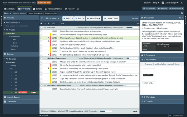
I sought to redesign Axosoft’s project management application for two reasons: bring it in line with our current branding and trade dress, and continue to remove legacy aspects of its Windows desktop roots along with bringing in some much-needed UX improvements. My intent with this redesign, is that much of the design work would rely on the same CSS and style framework we use on our product and support sites.
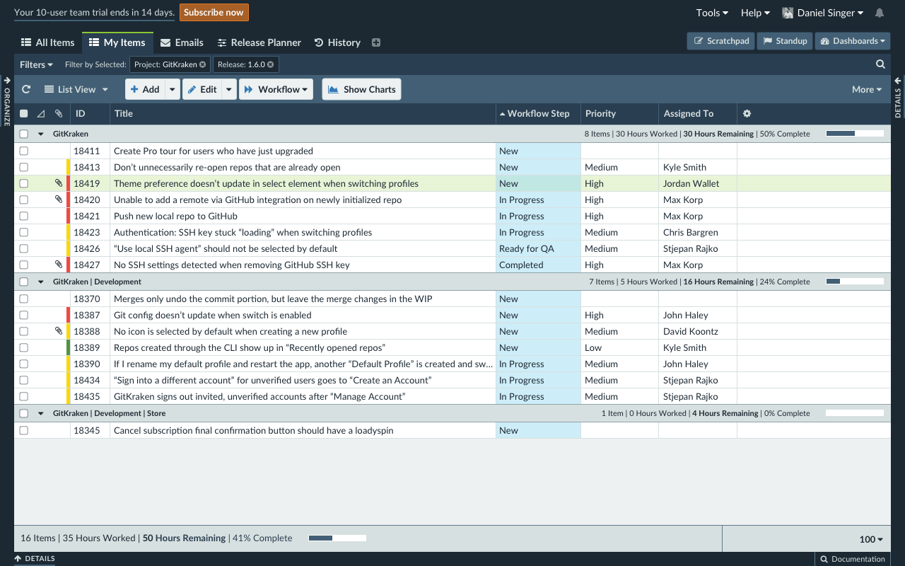
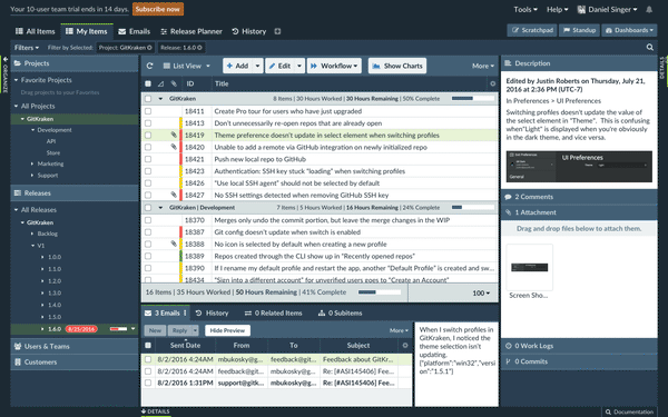
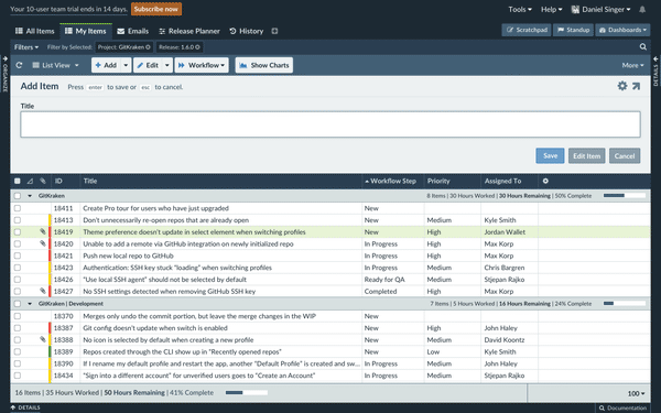
My primary objective with the main workspace was to bring in Axostyle, the proto-design system I was already using in our marketing sites. Additionally, I made some UI changes, including moving the filter options toolbar up below each workspace tab to illustrate that those filter options are saved on a tab-by-tab basis.
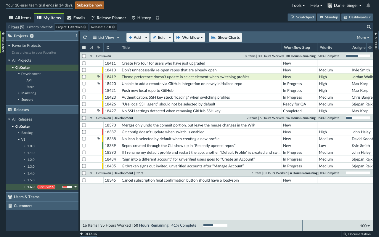
I also needed to come up with the look and feel of the Organize Panel UI, which is used to filter items in the workspace. For this, I reduced the overall UI by tucking uncommonly used buttons into options icons (the horizontal ellipsis in the Projects pane header, for instance), as well as making it easy to add new entries to these categories (the Quick Add button appears on hover next to the Projects text). These changes were influenced by our other application, GitKraken.
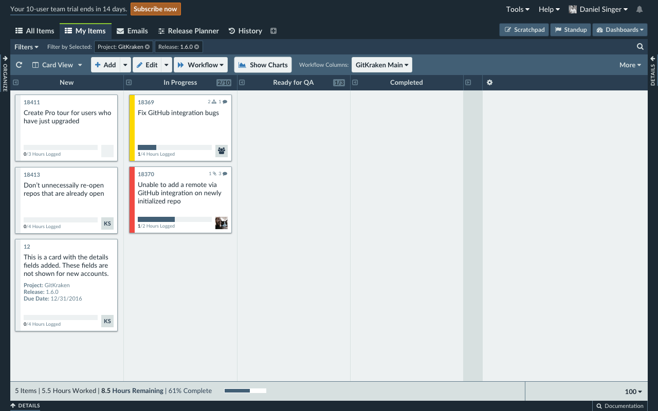
I also had to figure out the design of the Card View mode, which turns the workspace into a kanban planning board. Here, I spent some time working on an improved version of our item cards, focusing not only on clarity, but also emphasizing when items lacked information, such as assigned user, work added, priority, and more. This design was influenced by the work the team was doing for the upcoming mobile application.
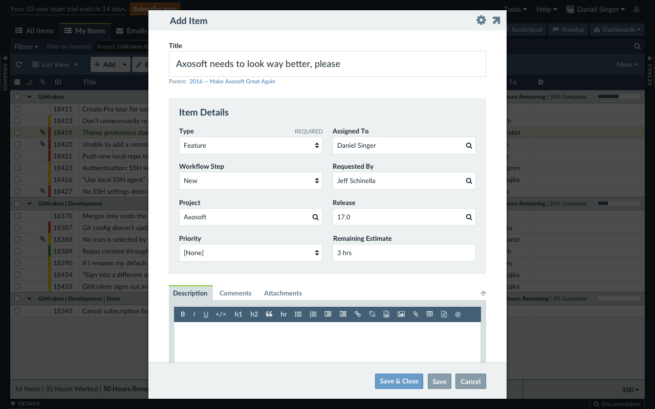
Once of the most critical components of Axosoft is the “item template”, where individual work items are “filled out” in a form that is customizable by each team. However, the current item template is a low contrast, full-width interface that can be difficult to use and gain information from. So my primary design objective here was to condense the item template into a fixed-width modal, as well as set aside special fields like the title and description.
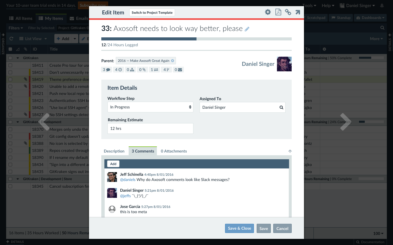
When viewing and editing an existing item, I tried a more experimental layout that evoked more of our mobile interface. At the top, above the item information fields, the summary information allows the user to quickly see progress, parent items, assigned users, and more.
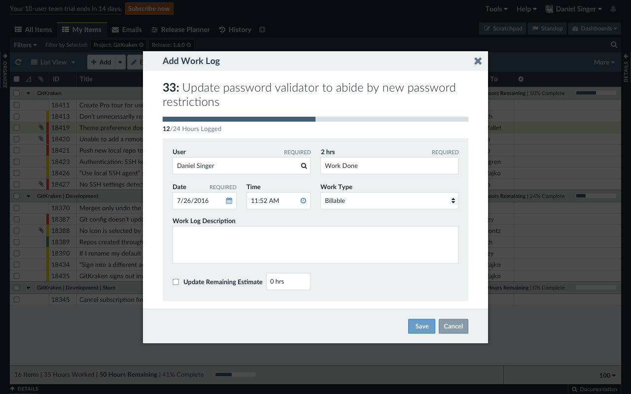
Adding work to an item used a specialized field template that I actually mocked up first before working on the full item templates.
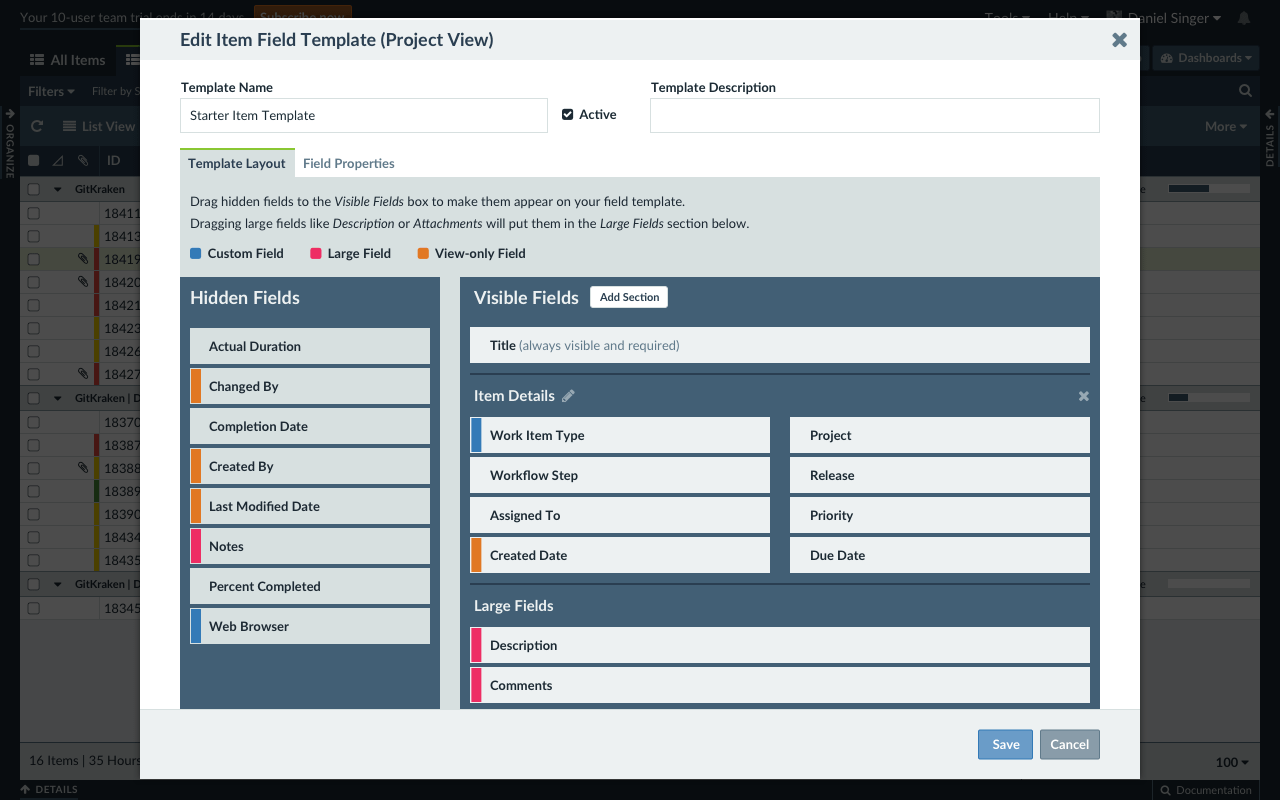
The field template editor is one of the most complicated and potentially confusing parts of the app. I tried to come up with a solution that split the user interface into managing the layout of the template, and managing the properties of each field. One other thing I did here was add more copy to better help explain this functionality.
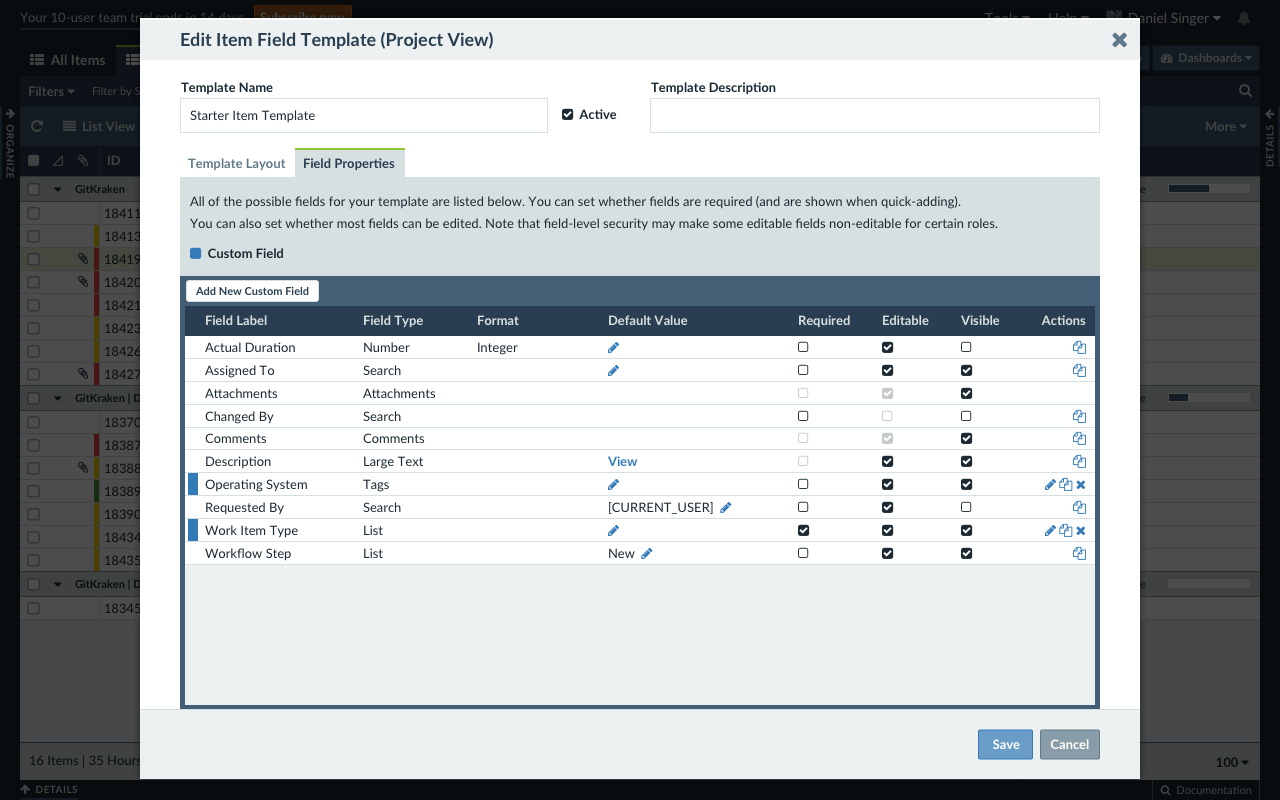
And this is where you manage the properties of each field in the template, as well as creating custom fields. Ultimately this approach traded one type of complexity for another, and it did not make it in the release. This mockup still had some use as this table pattern I redesigned is used in many other parts of the UI.
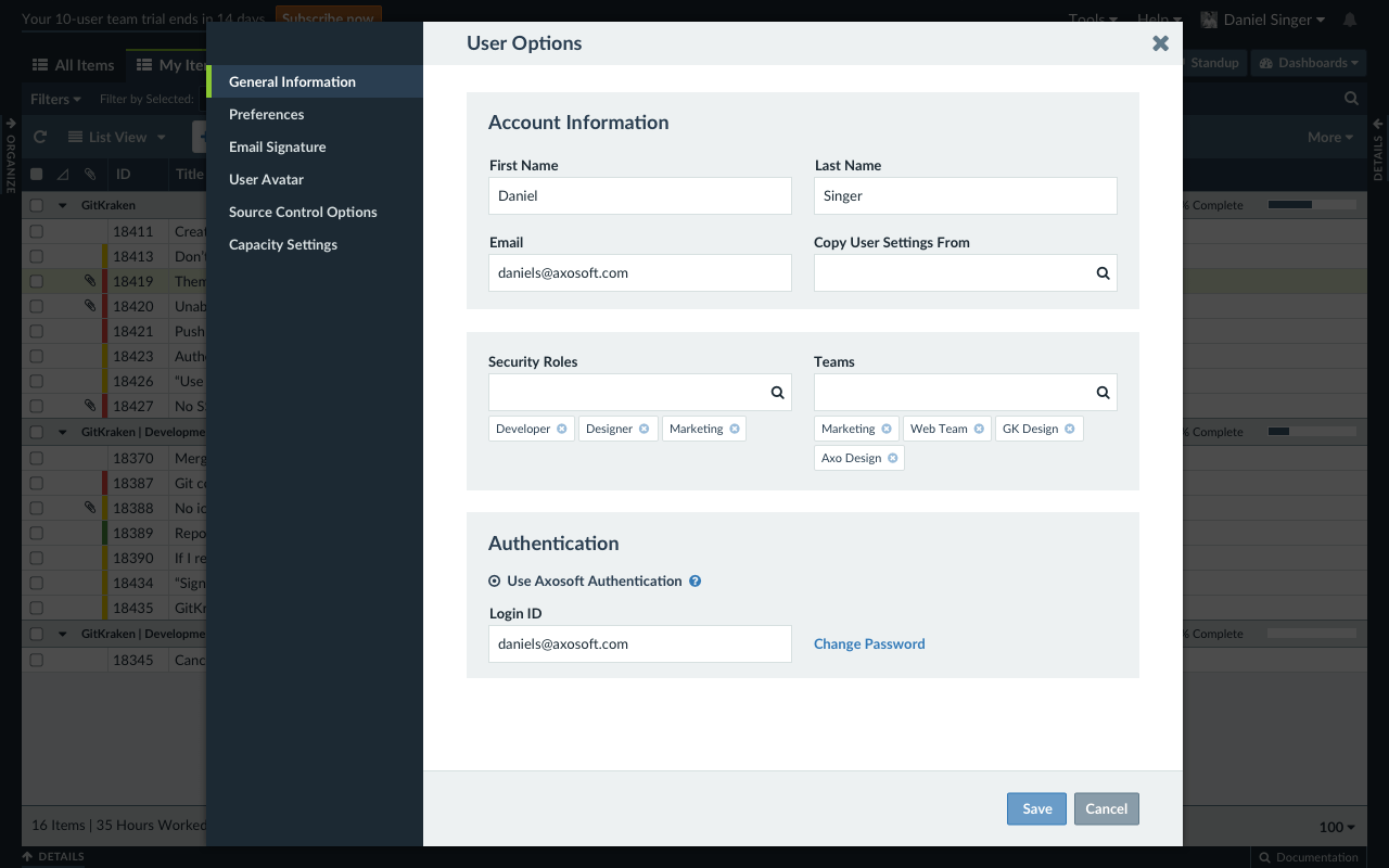
I also spent some time thinking about the settings interface, since administrators will spend plenty of time in these screens. Most critical to this redesign was pulling the sidebar navigation out to provide better spatial and color contrast, as well as continuing to evoke the look and feel of item templates in the option fields themselves. The “tags” below Security Roles and Teams were the same pattern as the active filters in the main workspace, and I ended up writing code for these in Axostyle due to their flexible use.
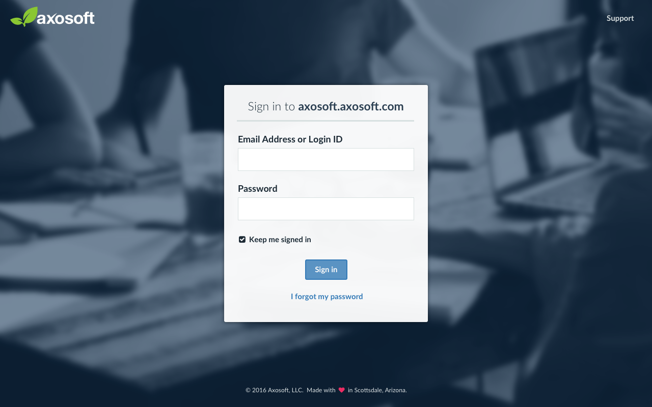
I also explored a (mobile-friendly) redesign of the login screen. This is a critical part of the UI for several reasons. One, it’s a bridge between the onboarding funnel on our marketing website and the user interface in the app, so there needed to be a seamless transition in branding and UX. Two, on mobile, this could potentially be the login point for mobile users, at which point they would be rerouted to our mobile app. There was also a variety of messages and prompts that could appear here, but I did not include them in my mockup.
