Zonar Systems: DSPLY Design System
Auditing and planning growth of an emerging design system
I was brought on to Zonar Systems’ UX team (a subsidiary of Continental) as senior design technologist to help grow their nascent design system (DSPLY). As someone whose prior experience included working on a mature design system (Smartsheet) as well as building my own initial version (Offerpad), my role was crucial for elevating a pattern library codebase and Figma design library into a unified entity to benefit the product organization.
Outcomes
- Design principles defined for the design org and DSPLY
- Audit of the Angular-based component library, detailing exactly how each component was used in product code and by which teams
- Clearer alignment across the company for adopting a design system
- Established a documentation plan involving Confluence and Storybook
Design principles
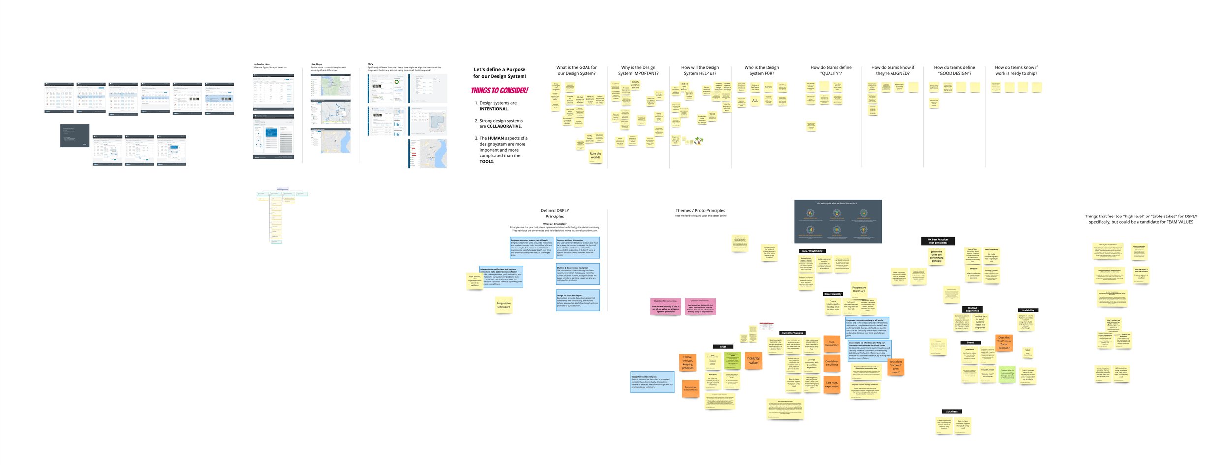
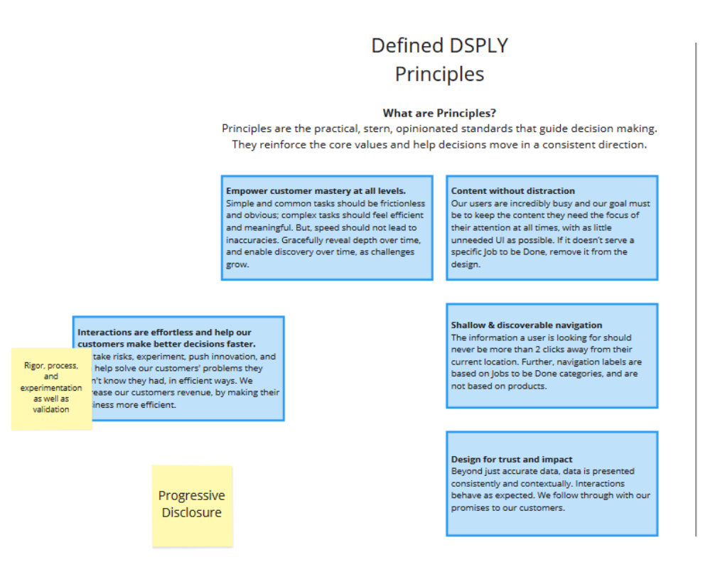
Design principles are a foundational layer, not just for a design system, but for the design organization as a whole. At Zonar, principles needed to be defined to help guide further decisions we would need for DSPLY, such as color and other foundational elements. I spearheaded the need for these principles, and working with my manager, Richard Robinson, who was leading our DesignOps team, we coordinated workshops with our other designers to build out these principles.
Analysis of the design system
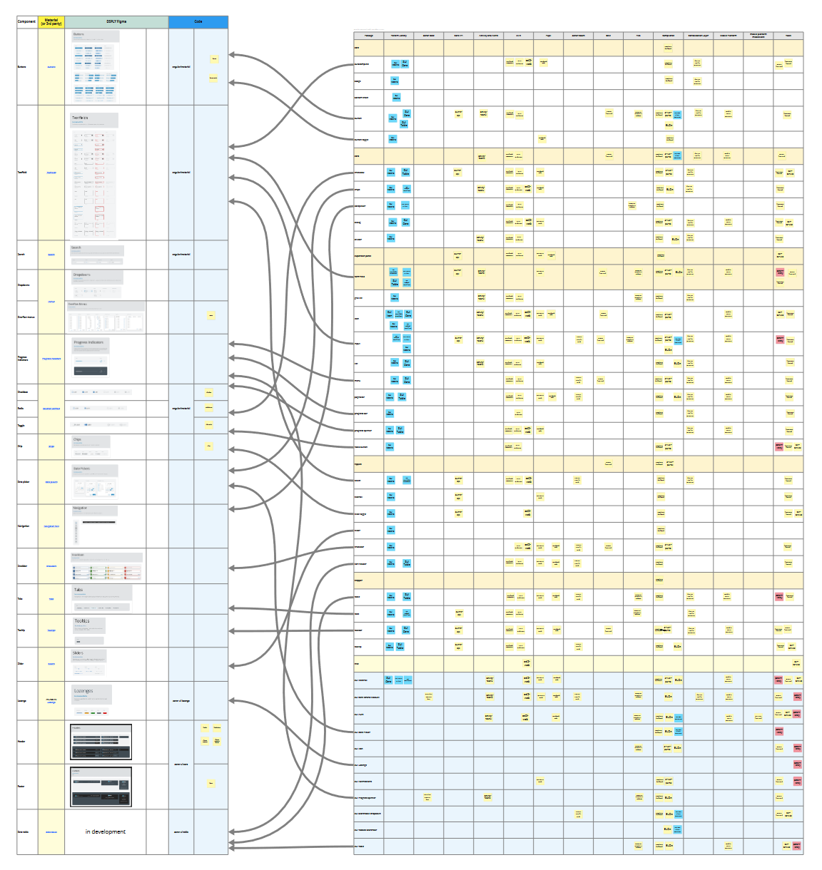
First, I had to get familiar with the existing design system. The Zonar pattern library was based on Angular Material, with most components sourced directly from Material. The separate components Zonar engineers maintained were custom components needed for product. Overall, the pattern library was split over about a dozen repositories.
In addition, there was no central authority for maintaining the pattern library. Individual engineering teams were separately mostly by product and worked independently, and this extended to the pattern library as well. Code changes were made only when there was a product need for doing so and by the engineering team associated with the product. This also meant that there was no documentation for the pattern library beyond what Google provides for Angular Material. Many teams used the pattern library and its associated resources (tokens, palette maps) inconsistently across the product suite.
One of my first projects was to map out all of the pattern library repositories and Angular Material components, and show which engineer teams used what in their own product repos. This helped illustrate to stakeholders the current state of the pattern library when my manager, and I argued for some level of ongoing, centralized maintenance and ownership of the pattern library.
On the design side, the design system existed entirely within the Figma design library, based on Material Design spec. Product designers used these library components directly in product work but there was little opportunity to continually maintain the design library outside of contributions of new components by the product teams.
During the project work outlined below, it became clear to me the number of inconsistences between what the Figma design library included and what was actually possible in the Angular Material code base. It was my hope that in time they could be reconciled with direct and ongoing curation of the design system.
In addition to analysis, Richard and I worked on process design for DSPLY: how might the multiple teams and disciplines involved would contribute and utilize the design system.
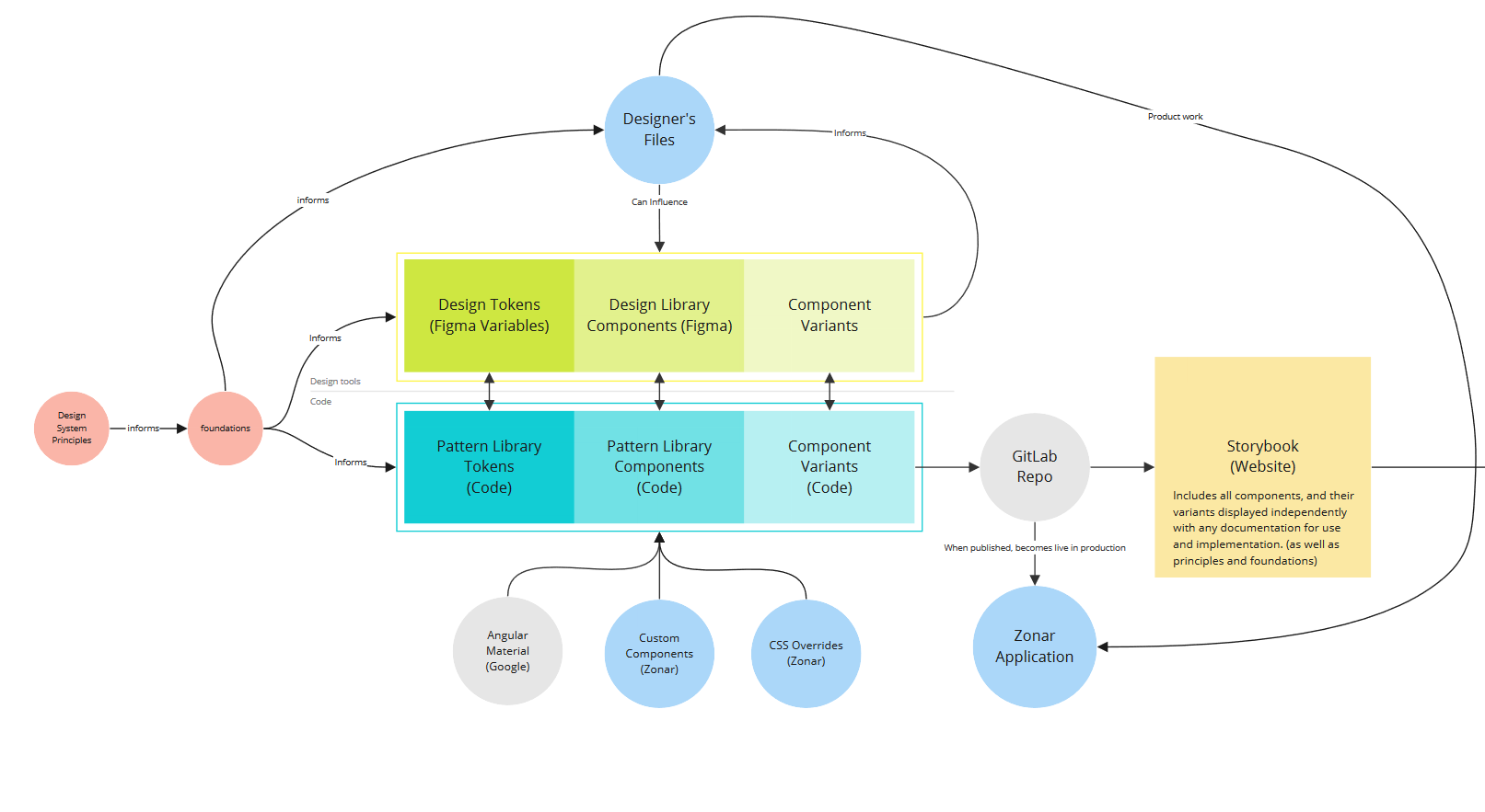
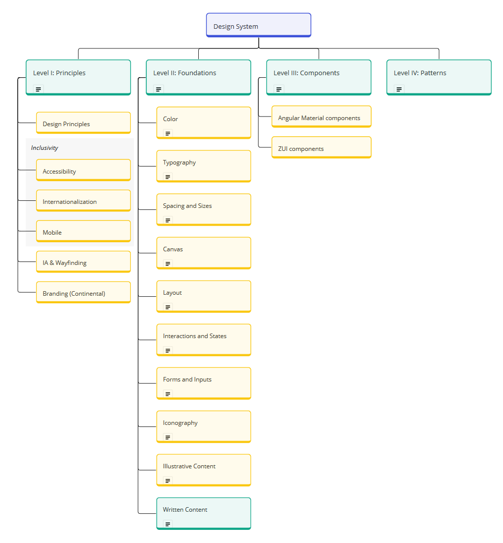
Planning documentation
I identified early on that the lack of centralized documentation for the design system as a whole was holding back serious progress on improving the system. I already knew, based on prior experience, that not only does good design system documentation provide meaningful component usage guidelines for both engineering and UX roles, but more essential information was needed:
- we required the design principles to be codified to guide our UX efforts
- these principles would in turn inform our foundational guidelines on typography, spacing, color, interactions, responsive design, and so on
- these foundations would improve and fill gaps in our components
- and we could even provide guidance on how to use components together for commonly used patterns.
I mapped out all of these requirements, based closely on my prior work on documentation while at Smartsheet.
We also needed a place for this content. The UX team and sometimes the engineers were already using Confluence, so we continued to build out new documentation (especially at the component level) using that tool. We also planned to move beyond Confluence, as its limited formatting features and distance from the actual codebase made it easy to ignore. I advocated for engineering to set up a Storybook instance we could use to house this content alongside component specimens from the pattern library in a centralized destination. Being able to render the components in Storybook was a hard requirement, so that any stakeholder could work with the specimens. Initial work was done by engineers to make the existing pattern library components work within Storybook.