Zonar Systems: Color Design Tokens
Building out a modern approach to managing color
While at Zonar Systems, I was able to work on one of my favorite aspects of a design system: the color library, along with the naming scheme and design token strategy, drawing upon my previous experience.
Outcomes
- Devised a design token scheme, for use in both the Angular code as well as our Figma library
- Worked with the design director on a comprehensive color framework overhaul, incorporating updated branding and design requirements
Background
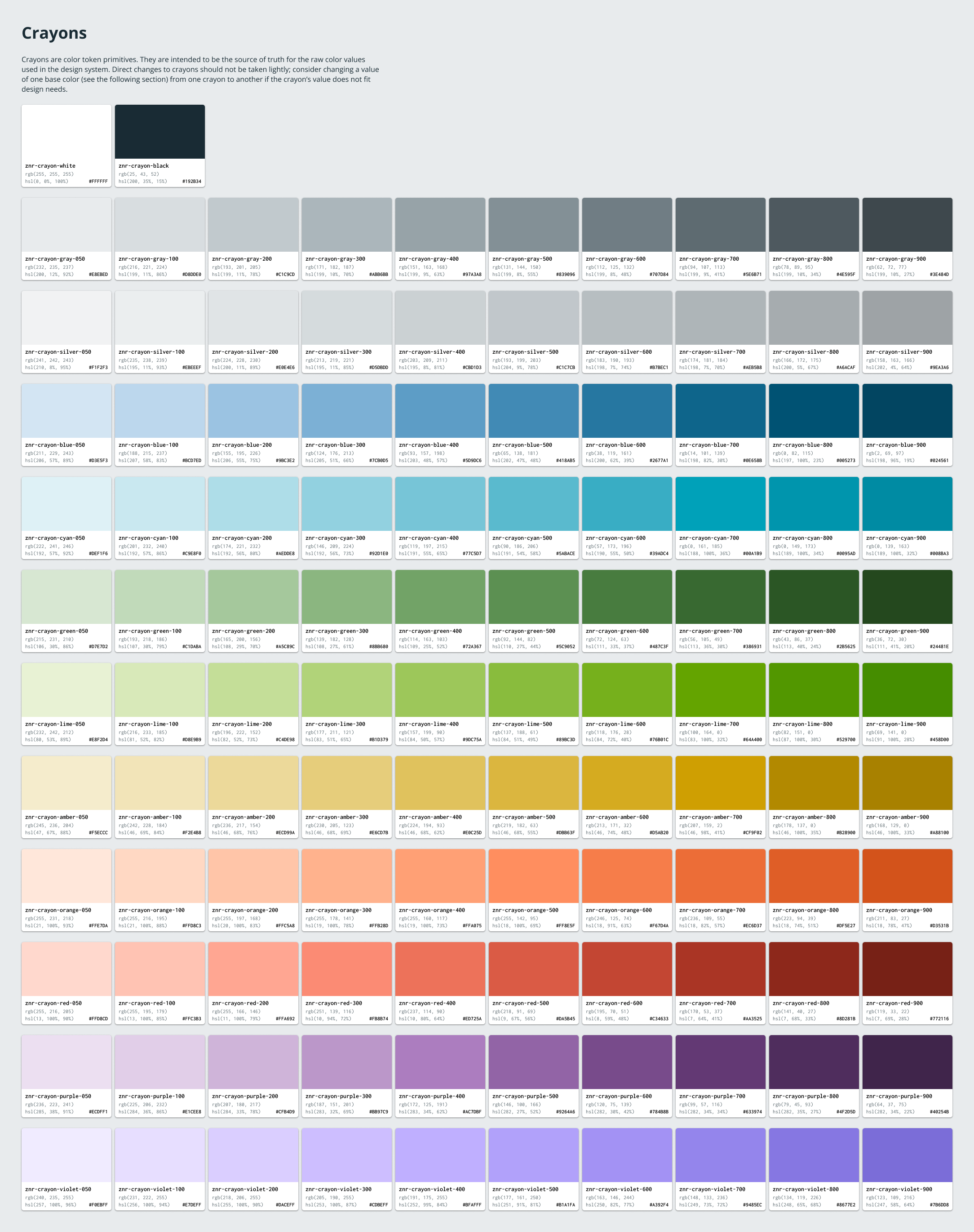
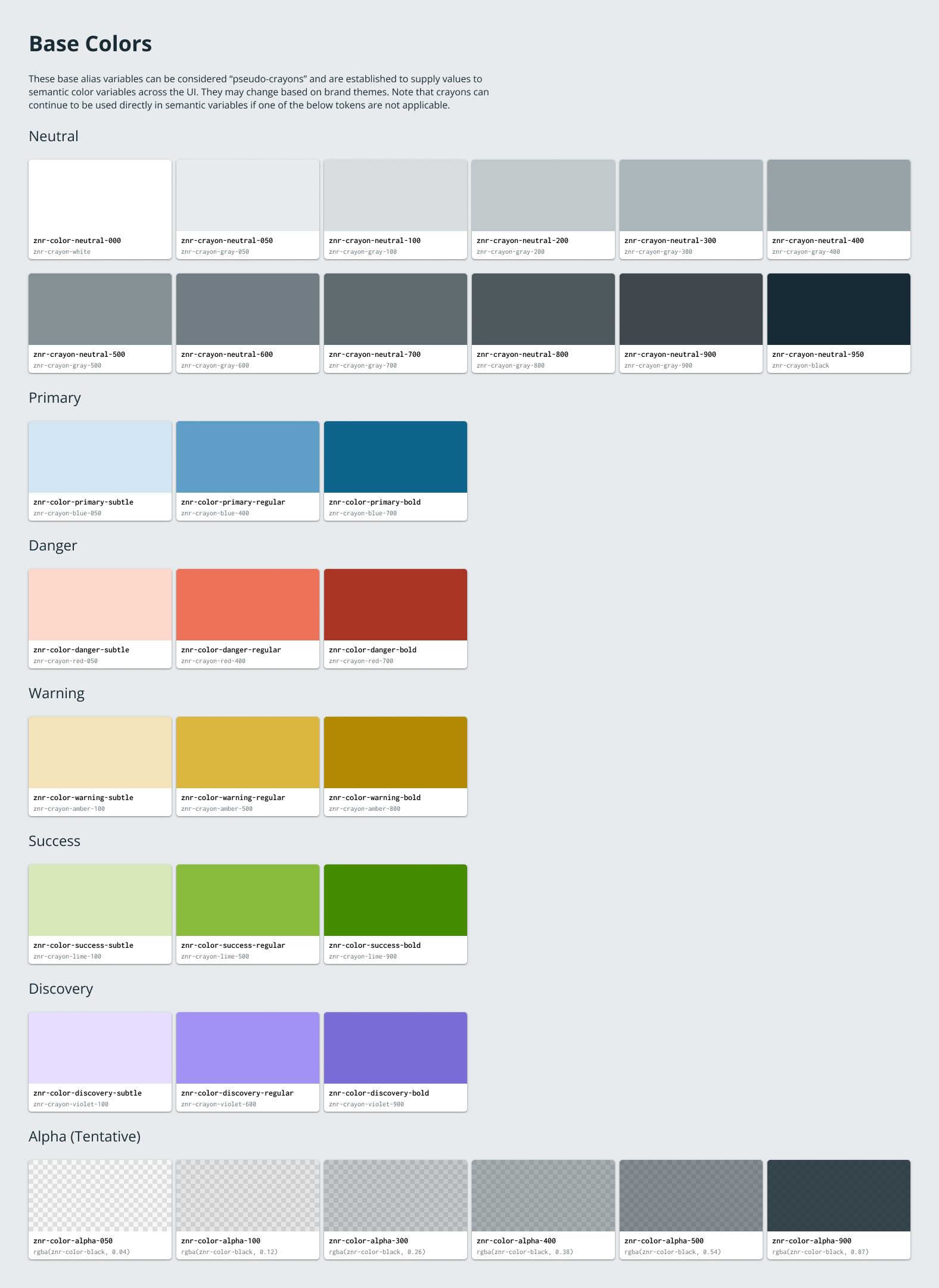
While at Smartsheet, I participated in a hackathon project with other colleagues to explore how we could modernize the color variables in use in the Lodestar design system. At the time, the variables were defined as a list of hex codes stored in a single JavaScript file. During the hackathon, I developed a naming scheme of namespace-category-token-variant for design tokens in general, and split color tokens into two categories: “crayons” (sometimes called “primitives” by other organzations) and “aliases”. The approach was that the crayons were immutable constants that were named based on their color and were completely devoid of purpose. Aliases, on the other hand, used crayons as their value and were named solely for their purpose (brand, background, or primary, for example). On top of all that, I also established how these aliases variables would swap values based on theme (light, dark, or high-contrast).
Implementing a design token strategy
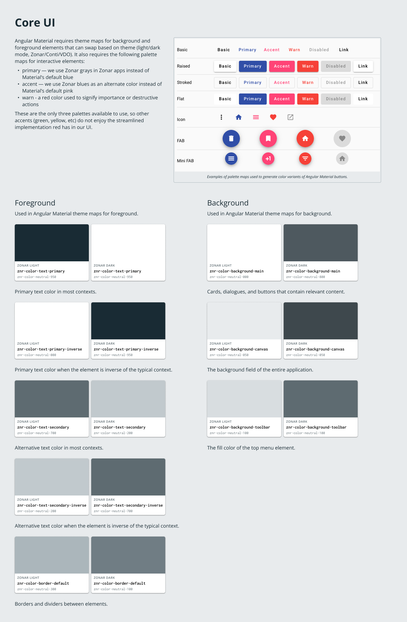
Fast-forward to Zonar, where our director of UX, Drory Ben-Menachem, was working on a revamped color palette for Zonar products. I met with him after his initial demonstration of the palette, and showed how the colors could be both extended and simplified to not only scale with product needs but also fit the requirements of a new color design token system for DSPLY. I based the potential color library on the Smartsheet scheme I had developed, including crayons and aliases. We needed the color system to meet our needs for neutral backgrounds and text, semantic elements (primary and destructive actions, for example), as well as data visualization needs in the product. It was also important that the color system itself, not necessarily the token values, could work for other Continental brands, and most importantly, that the tokens were compatible with how Angular Material works with color.
I organized the color tokens in Figma based on these considerations. This coincided nicely with the new design variables feature in Figma, allowing me to test it out as I built out the tokens for prototyping. I’ve included some artboards below that outlined these variables, including both the crayons and the aliases.